
Broadway
Poster and Booklet
The goal of this project was to explore typography by selecting a typeface and creating a visually compelling poster that showcases its essence.
The challenge was to effectively communicate the personality of the Broadway typeface while maintaining strong visual hierarchy and readability.
The goal of this project was to explore typography by selecting a typeface and creating a visually compelling poster that showcases its essence.
The challenge was to effectively communicate the personality of the Broadway typeface while maintaining strong visual hierarchy and readability.
Industry
Industry
Industry
Service
Service
Editorial
Tools Used
Tools Used
Illustrator and Indesign
Timeline
Timeline
1 week
Broadway
Poster and Booklet
The goal of this project was to explore typography by selecting a typeface and creating a visually compelling poster that showcases its essence.
The challenge was to effectively communicate the personality of the Broadway typeface while maintaining strong visual hierarchy and readability.
Industry
Industry
Service
Editorial
Tools Used
Illustrator and Indesign
Timeline
1 week
Design Process
Design Process
Design Process
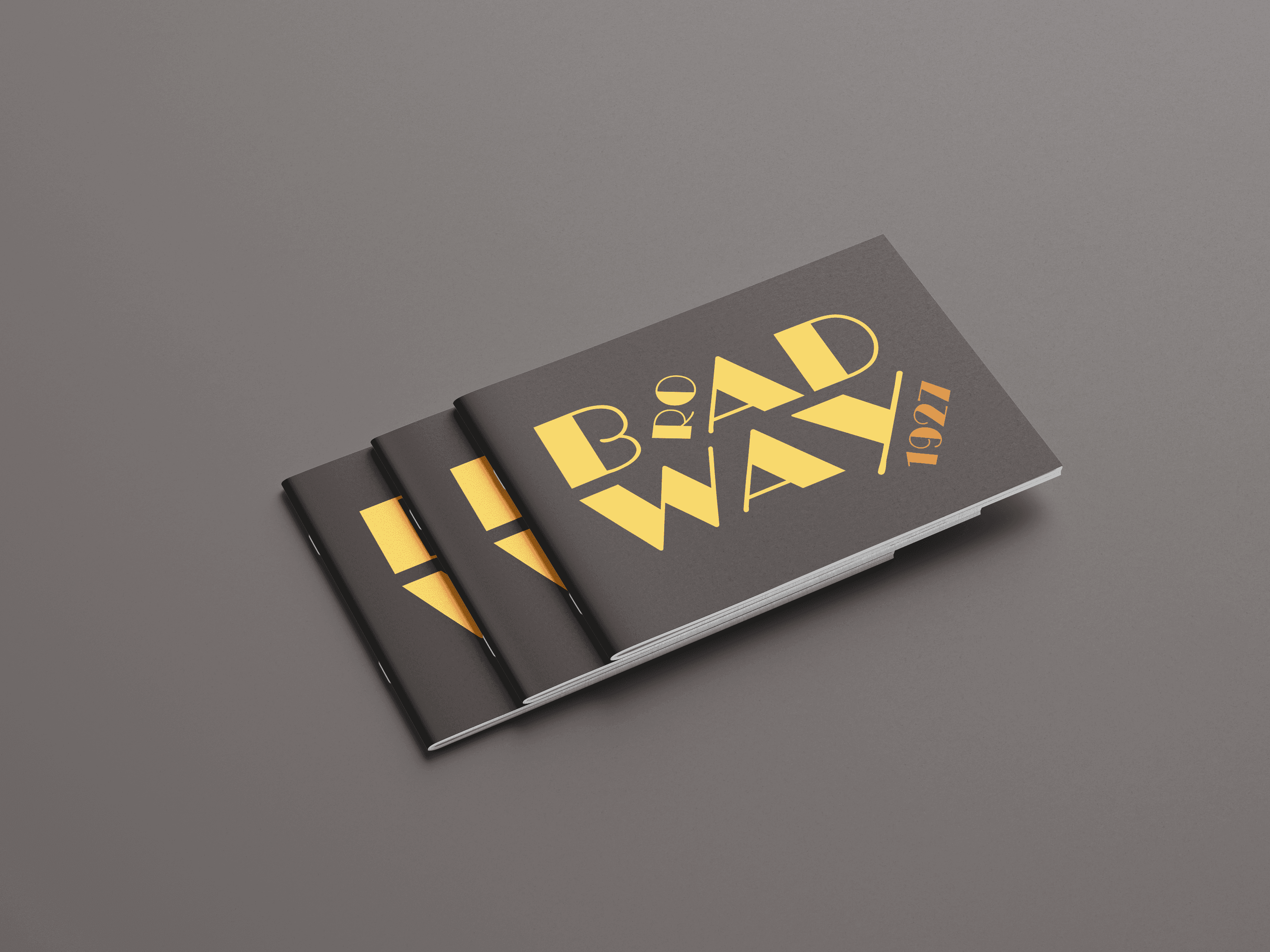
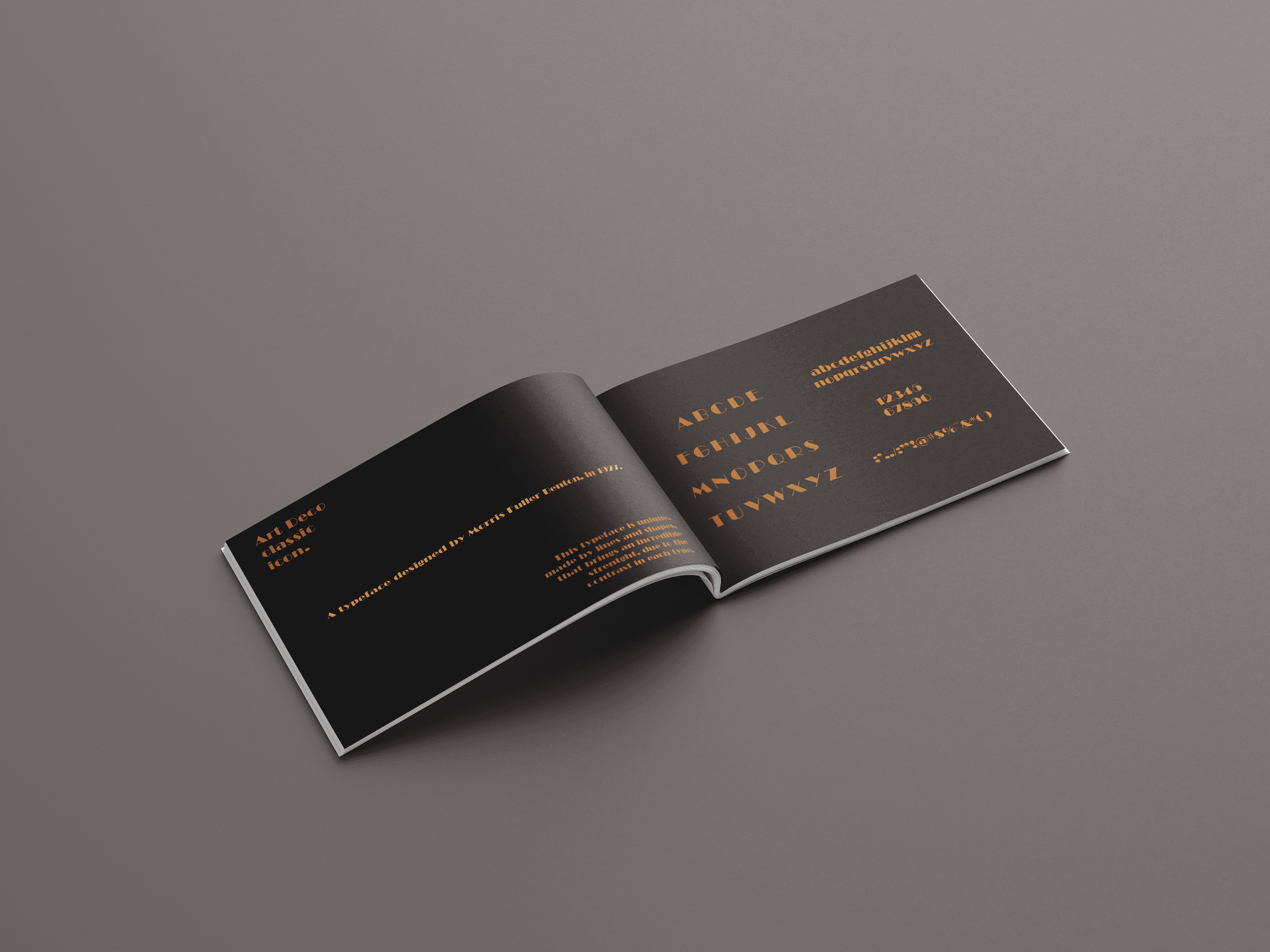
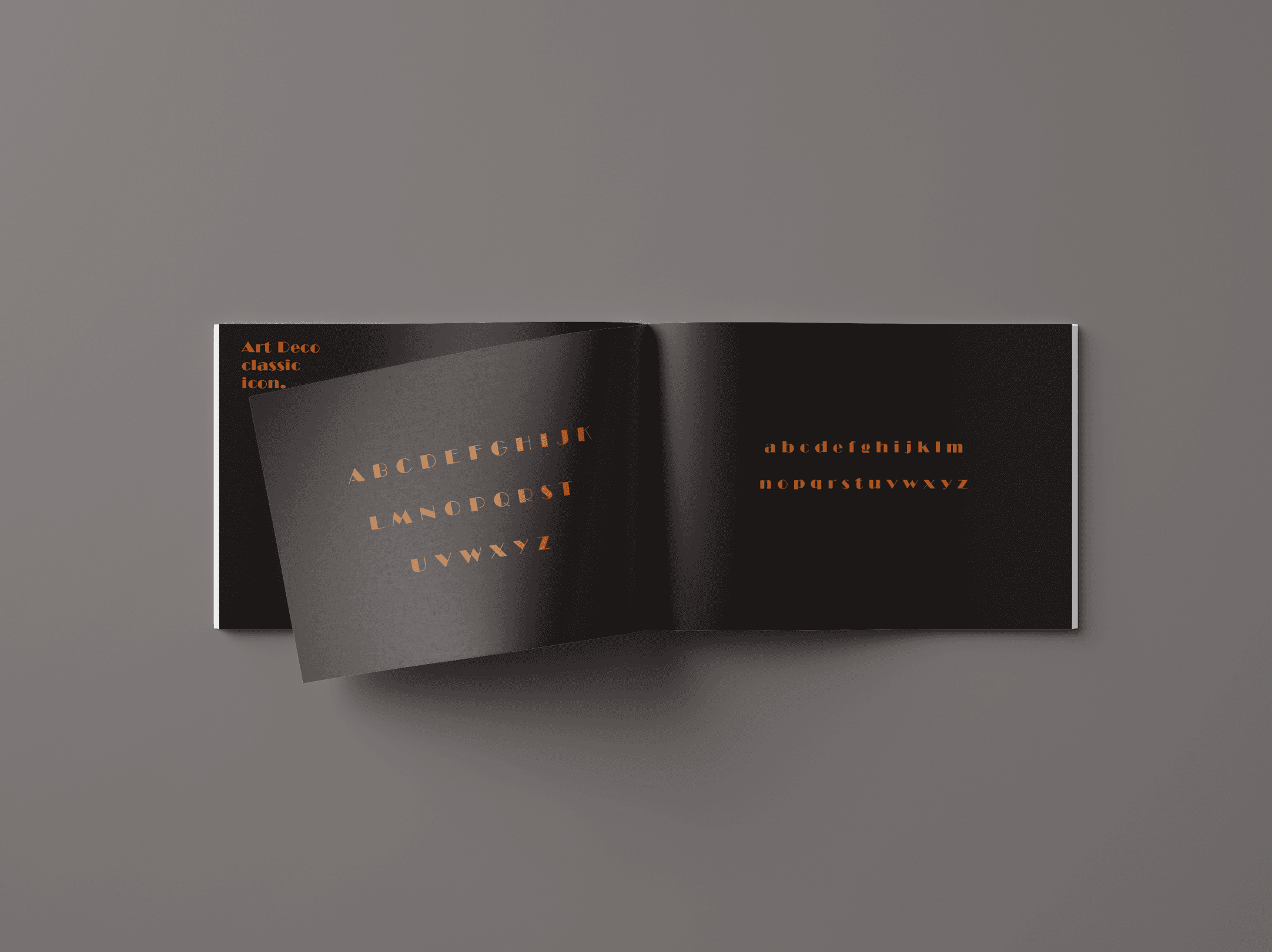
I began by researching the history and characteristics of Broadway, a typeface designed by Morris Fuller Benton in 1927 for.
Known for its bold geometric shapes and high contrast, Broadway captures the elegance and extravagance of the Art Deco movement.
Inspired by its vintage yet timeless appeal, I developed a composition that highlights its strong presence.
Once the poster was designed, I adapted its layout into a booklet, expanding the visual language while ensuring consistency in style, typography, and layout.
Key Insights
Key Insights
Key Insights
Through this process, I discovered how typefaces evoke emotions and define an era.
Broadway’s decorative nature required careful spacing and layout adjustments to maintain legibility while preserving its distinct character.
Additionally, I experimented with composition and contrast to enhance its visual impact.
The Solution
The Solution
The Solution
The final design is a striking poster that embodies the sophistication of the Broadway typeface, complemented by a booklet that provides a deeper exploration of its design elements.
The cohesive visual approach ensures that the typeface’s unique qualities shine across different formats.
The final design is a striking poster that embodies the sophistication of the Broadway typeface, complemented by a booklet that provides a deeper exploration of its design elements.
The cohesive visual approach ensures that the typeface’s unique qualities shine across different formats.
The final design is a striking poster that embodies the sophistication of the Broadway typeface, complemented by a booklet that provides a deeper exploration of its design elements.
The cohesive visual approach ensures that the typeface’s unique qualities shine across different formats.

Impact & Results
Impact & Results
Impact & Results
By thoughtfully presenting the Broadway typeface, this project demonstrates how typography can be more than just text.
It can set a mood, tell a story, and create a lasting impression.
The design effectively showcases Broadway’s bold and elegant aesthetic, making it an engaging and informative experience for viewers.

Connect to Content
Add layers or components to infinitely loop on your page.
Have an Idea in Mind?
I'm thrilled to engage with you! Whether you're looking to start a new idea or rejuvenate an existing one, I'm prepared to help transition your visions into concrete actions.
LET’S TALK

As a UX/UI and Graphic Designer, I craft intuitive digital experiences and stunning visuals, delivering meaningful solutions that connect with users.
© 2025 - Guilherme Goes Lopes
GGL Design - Where the idea turn into life
Connect to Content
Add layers or components to infinitely loop on your page.
Have an Idea in Mind?
I'm thrilled to engage with you! Whether you're looking to start a new idea or rejuvenate an existing one, I'm prepared to help transition your visions into concrete actions.
LET’S TALK
As a UX/UI and Graphic Designer, I craft intuitive digital experiences and stunning visuals, delivering meaningful solutions that connect with users.
© 2025 - Guilherme Goes Lopes
GGL Design - Where the idea turn into life