
Home Workout App
UI Redesign
I am delighted to present the redesign of a mobile app that showcases my expertise as a UI designer. Throughout this project, my focus was on creating a visually stunning interface with the incorporation of illustrations and a darker theme.
The main objective of this project was to revamp the UI of the mobile app, elevating its visual appeal, usability, and overall user experience. With a user-centric approach, I conducted extensive research and gathered valuable insights to identify pain points and areas for improvement.
Industry
Industry
Industry
Service
Service
Service
Tools Used
Tools Used
Tools Used
Timeline
Timeline
Timeline
Home Workout App
UI Redesign
I am delighted to present the redesign of a mobile app that showcases my expertise as a UI designer. Throughout this project, my focus was on creating a visually stunning interface with the incorporation of illustrations and a darker theme.
The main objective of this project was to revamp the UI of the mobile app, elevating its visual appeal, usability, and overall user experience. With a user-centric approach, I conducted extensive research and gathered valuable insights to identify pain points and areas for improvement.
Industry
Industry
Service
Service
Tools Used
Tools Used
Timeline
Timeline
To start my redesign, I had to decide the style I would like to implement for this project.
My goal was to mix my skills in drawing with what I have learned in UI, so for that I created a series of illustrations to make the design more fun and attractive.
In addition I would like to say I mixed a minimalist style with shadows in a darker color pallete with bright colors. It all mixed to created contrasts and direct the user for the most important sections.
Here we can see my redesign for the app icon, in which I used the style I created for the new design.
Typography
Typography
Typography
In the typography of my redesign, my choice is to have a modern and cleaner look, as well a typeface with good x-height so the app has a better readability.
In the typography of my redesign, my choice is to have a modern and cleaner look, as well a typeface with good x-height so the app has a better readability.
In the typography of my redesign, my choice is to have a modern and cleaner look, as well a typeface with good x-height so the app has a better readability.
Poppins Family
Poppins Family
Poppins Family

COLOR PALLETE
COLOR PALLETE
COLOR PALLETE
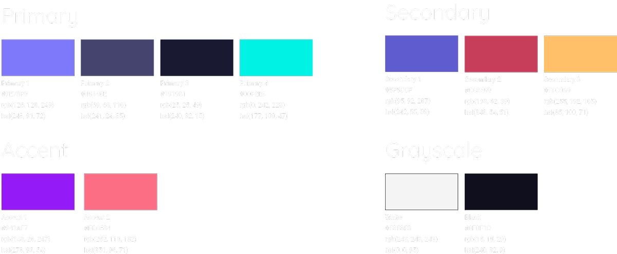
For the color pallete, I decided to go with a style similar with dark mode, but using as primary colors tones of purple.
For the rest of the design, I used more bright colors, in which I could make contrasts to guide the user.
For the color pallete, I decided to go with a style similar with dark mode, but using as primary colors tones of purple.
For the rest of the design, I used more bright colors, in which I could make contrasts to guide the user.
For the color pallete, I decided to go with a style similar with dark mode, but using as primary colors tones of purple.
For the rest of the design, I used more bright colors, in which I could make contrasts to guide the user.
ICONOGRAPHY
ICONOGRAPHY
ICONOGRAPHY
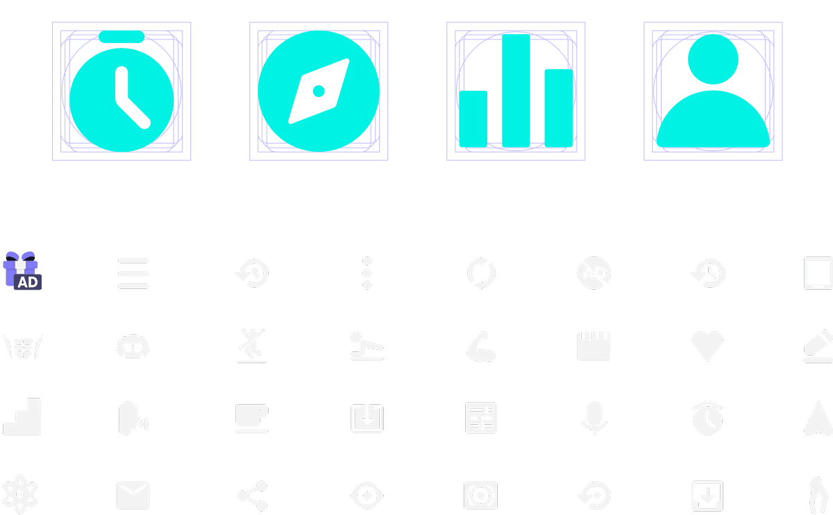
For the Icons redesign, my main idea was to create them inside of a master grid in which brings balance to the icons.
My intention was to create icons with some different properties for each functionality.
For the Icons redesign, my main idea was to create them inside of a master grid in which brings balance to the icons.
My intention was to create icons with some different properties for each functionality.
For the Icons redesign, my main idea was to create them inside of a master grid in which brings balance to the icons.
My intention was to create icons with some different properties for each functionality.
BUTTONS & NAV
BUTTONS & NAV
BUTTONS & NAV
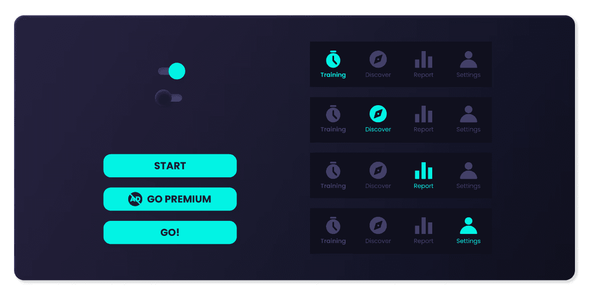
To create the buttons, I really wanted to call attention to them, so used a bright color to bring a lot of contrast with the background.
In the buttons part, there is no much to show due to, on my redesign, there are more concentration of cards.
To create the buttons, I really wanted to call attention to them, so used a bright color to bring a lot of contrast with the background.
In the buttons part, there is no much to show due to, on my redesign, there are more concentration of cards.
To create the buttons, I really wanted to call attention to them, so used a bright color to bring a lot of contrast with the background.
In the buttons part, there is no much to show due to, on my redesign, there are more concentration of cards.
ILLUSTRATIONS
ILLUSTRATIONS
ILLUSTRATIONS
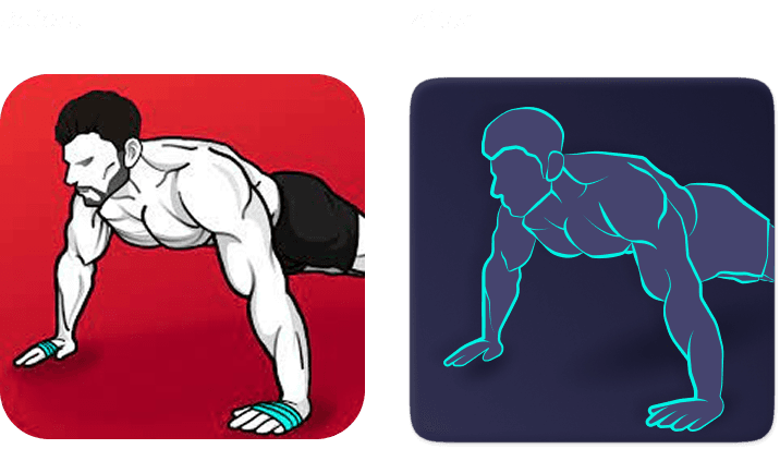
As my goal here was to show my skills in illustration mixed with the UI created by me.
To start we can see the illustration from Training page, in which are made in different styles to show different sections.
But my intention is to keep the minimalism during all the project.
On the second part of illustrations, it is possible to see how it can help the user to understand in a faster way each part with just few lines and trying always to be minimalist, due to it has to contrast with the background.

Here, the illustrations are with more colors due the background is more simple and allows to play a bit more with the illustrations.
Here, the illustrations are with more colors due the background is more simple and allows to play a bit more with the illustrations.
Here, the illustrations are with more colors due the background is more simple and allows to play a bit more with the illustrations.

Cards
Cards
Cards
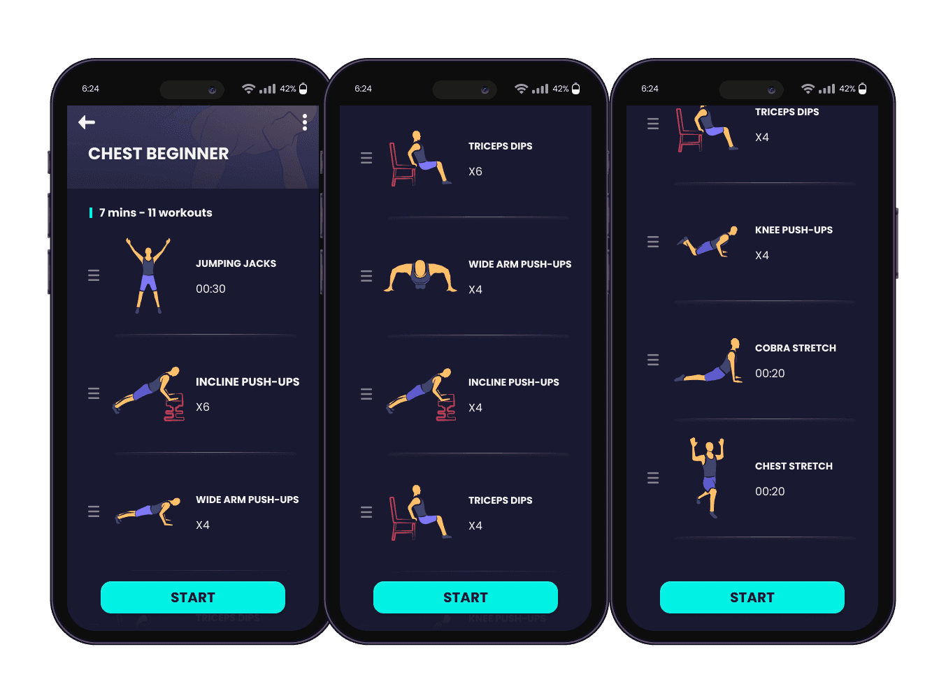
In the cards, I separated by sections. In the first one we can see cards for the training page, in which have different drawings to help to see about the exercise. I wanted to keep the attention of the user for the name of the exercises and use the illustrations as reference.
In the cards, I separated by sections. In the first one we can see cards for the training page, in which have different drawings to help to see about the exercise. I wanted to keep the attention of the user for the name of the exercises and use the illustrations as reference.
In the cards, I separated by sections. In the first one we can see cards for the training page, in which have different drawings to help to see about the exercise. I wanted to keep the attention of the user for the name of the exercises and use the illustrations as reference.

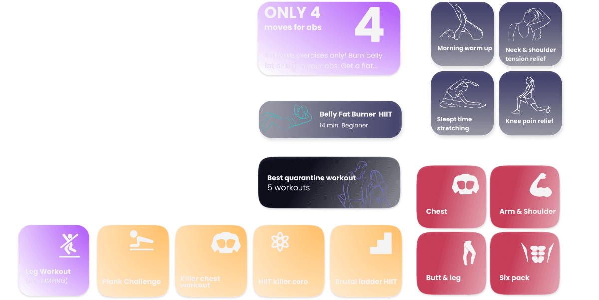
On the second page of cards, we have all cards from Discover page, in which are made using text plus the illustrations. Here, the illustrations are minimalist to do not make the screen so busy.
On the second page of cards, we have all cards from Discover page, in which are made using text plus the illustrations. Here, the illustrations are minimalist to do not make the screen so busy.
On the second page of cards, we have all cards from Discover page, in which are made using text plus the illustrations. Here, the illustrations are minimalist to do not make the screen so busy.
Last part of cards, show from the rest of the pages.
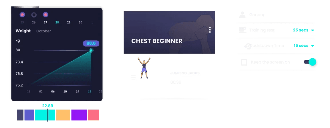
We can see a chart from the Report page, followed by the cards is possible to see when click on a exercise and in the end, the cards in which creates the settings page.
Last part of cards, show from the rest of the pages.
We can see a chart from the Report page, followed by the cards is possible to see when click on a exercise and in the end, the cards in which creates the settings page.
Last part of cards, show from the rest of the pages.
We can see a chart from the Report page, followed by the cards is possible to see when click on a exercise and in the end, the cards in which creates the settings page.
Last part of cards, show from the rest of the pages.
We can see a chart from the Report page, followed by the cards is possible to see when click on a exercise and in the end, the cards in which creates the settings page.
Last part of cards, show from the rest of the pages.
We can see a chart from the Report page, followed by the cards is possible to see when click on a exercise and in the end, the cards in which creates the settings page.
Last part of cards, show from the rest of the pages.
We can see a chart from the Report page, followed by the cards is possible to see when click on a exercise and in the end, the cards in which creates the settings page.
Current Design
Current Design
Current Design
New Design
New Design
New Design
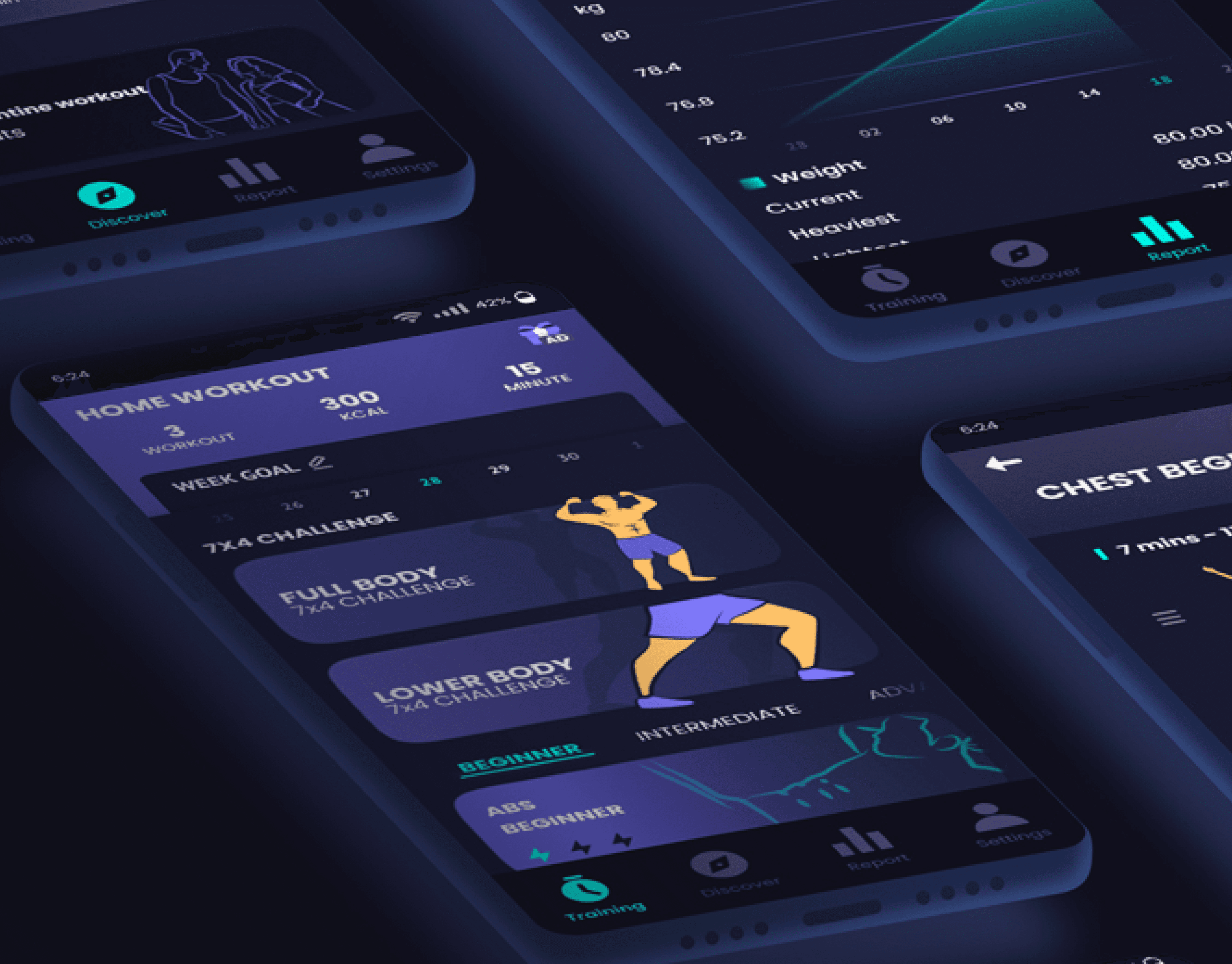
LAYOUT - TRAINING PAGE
LAYOUT - TRAINING PAGE
LAYOUT - TRAINING PAGE
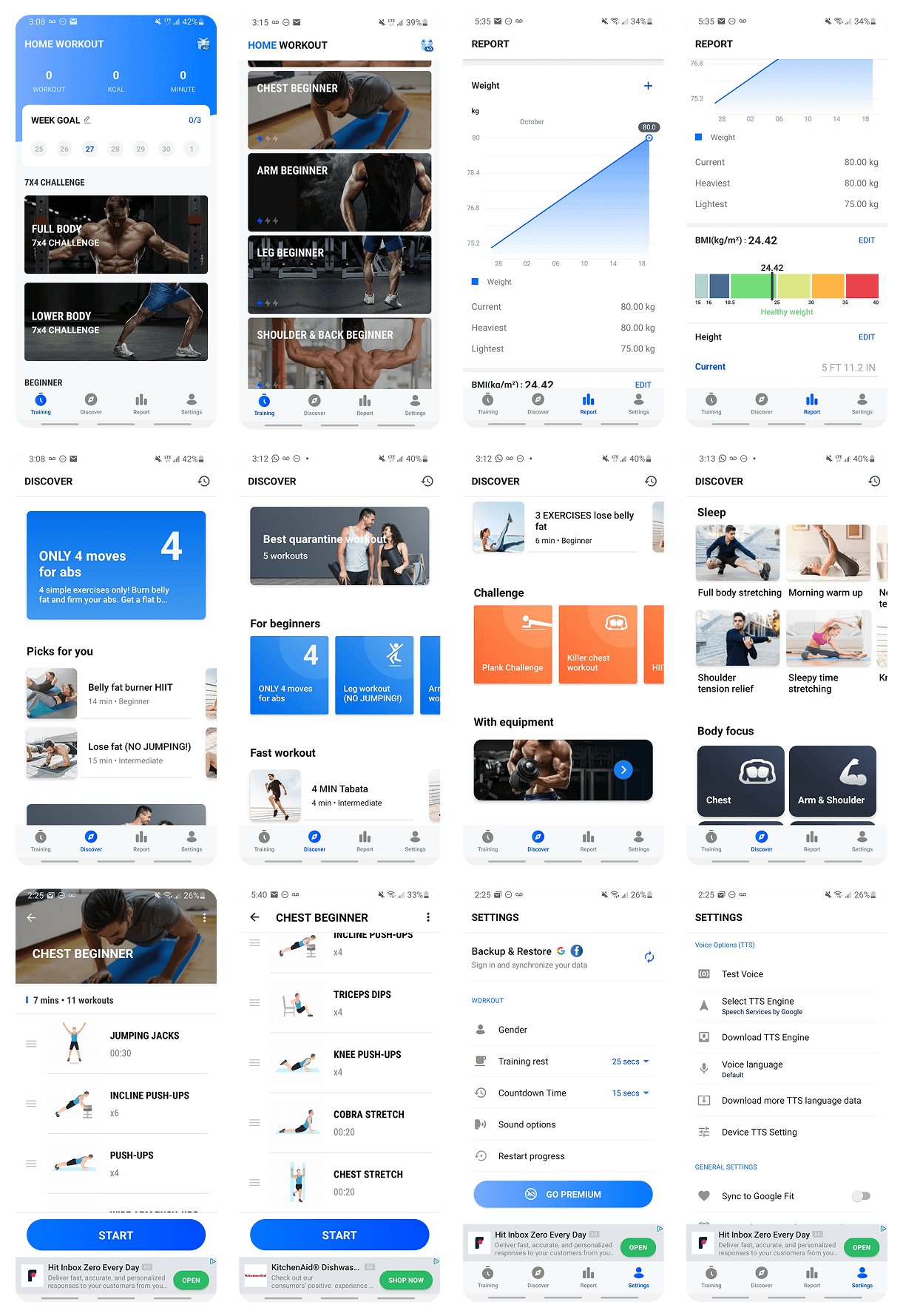
In this page, my idea was to keep most of the UX, but using my completely new Ui design.
But, there was one part I changed the UX for better user experience, due to in my new design, the user do not need to be scrolling vertically too much to see the exercises.
Now, user can scroll in a easier way horizontally.
And it is important to add that all the nav is with fix position when scrolling.

LAYOUT - EXERCISES PAGE
LAYOUT - EXERCISES PAGE
LAYOUT - EXERCISES PAGE
This is the only different page from the rest, due to there is no nav bar, in which turned to a button for you to start the exercise. As explained before, we see more colorful illustrations here due to a cleaner background.
This is the only different page from the rest, due to there is no nav bar, in which turned to a button for you to start the exercise. As explained before, we see more colorful illustrations here due to a cleaner background.
This is the only different page from the rest, due to there is no nav bar, in which turned to a button for you to start the exercise. As explained before, we see more colorful illustrations here due to a cleaner background.
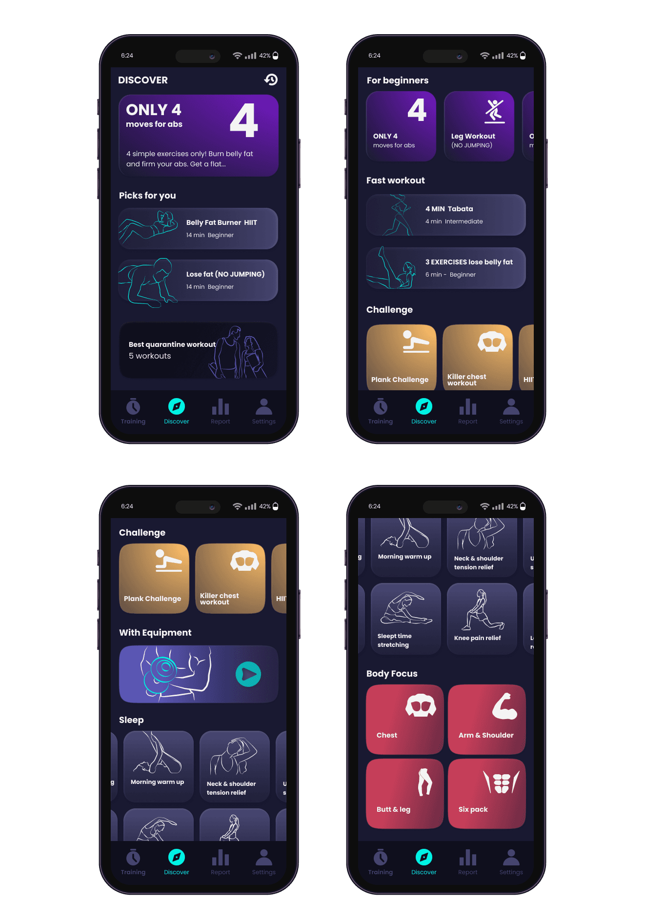
LAYOUT - DISCOVER PAGE
LAYOUT - DISCOVER PAGE
LAYOUT - DISCOVER PAGE
For the Discover page, due to many cards for the user to choose, my goal as to keep the most attention on the texts and use the illustrations as support and in different styles and colors to make it easier to see the difference between them.
For the Discover page, due to many cards for the user to choose, my goal as to keep the most attention on the texts and use the illustrations as support and in different styles and colors to make it easier to see the difference between them.
For the Discover page, due to many cards for the user to choose, my goal as to keep the most attention on the texts and use the illustrations as support and in different styles and colors to make it easier to see the difference between them.
LAYOUT - REPORT PAGE
LAYOUT - REPORT PAGE
LAYOUT - REPORT PAGE
In the Report page, to follow the ideas with a background with more design, wanted to make a good contrast to call the user’s attention on the most important parts of the page.
In the Report page, to follow the ideas with a background with more design, wanted to make a good contrast to call the user’s attention on the most important parts of the page.
In the Report page, to follow the ideas with a background with more design, wanted to make a good contrast to call the user’s attention on the most important parts of the page.

LAYOUT - SEETINGS PAGE
LAYOUT - SEETINGS PAGE
LAYOUT - SEETINGS PAGE
In the last page of my redesign, the icons got the illustrations place and were my focus here.
As explained before, the icons were created in a master grid to keep a consistency and balance between different dimensions.
With colors, made contrasts to call attention of the user.
In the last page of my redesign, the icons got the illustrations place and were my focus here.
As explained before, the icons were created in a master grid to keep a consistency and balance between different dimensions.
With colors, made contrasts to call attention of the user.
In the last page of my redesign, the icons got the illustrations place and were my focus here.
As explained before, the icons were created in a master grid to keep a consistency and balance between different dimensions.
With colors, made contrasts to call attention of the user.

Connect to Content
Add layers or components to infinitely loop on your page.
Have an Idea in Mind?
I'm thrilled to engage with you! Whether you're looking to start a new idea or rejuvenate an existing one, I'm prepared to help transition your visions into concrete actions.
LET’S TALK

As a UX/UI and Graphic Designer, I craft intuitive digital experiences and stunning visuals, delivering meaningful solutions that connect with users.
© 2025 - Guilherme Goes Lopes
GGL Design - Where the idea turn into life
Connect to Content
Add layers or components to infinitely loop on your page.
Have an Idea in Mind?
I'm thrilled to engage with you! Whether you're looking to start a new idea or rejuvenate an existing one, I'm prepared to help transition your visions into concrete actions.
LET’S TALK
As a UX/UI and Graphic Designer, I craft intuitive digital experiences and stunning visuals, delivering meaningful solutions that connect with users.
© 2025 - Guilherme Goes Lopes
GGL Design - Where the idea turn into life